The Theory of Related-ivity: Segment VI
Friday, March 27, 2026 - 19:30

The Theory of Related-ivity:
A History and Analysis of the Best Related Work Hugo Category
by Heather Rose Jones
(This is a serialized article exploring the history of the Best Related Work Hugo category in its various names and versions. If you’ve come in at the middle, start here.)
Contents
Part 3: Historic Trends
3.1 General Trends
3.1.1 Introduction
3.1.2 Basic Nomination Data
Part 3: Historic Trends
3.1 General Trends
3.1.1 Introduction
With all the administrative details out of the way, this begins the meat of the analysis. To some extent, this study has a case of “you need to read everything before you read everything else” so don’t expect it to be entirely linear. This first section will review and analyze descriptive data that is not related to the format or content of the works. The second section will analyze by Media format, the third by Category, and the fourth by Other Tags.
In each case the eras of the award will be compared, as well as determining whether there are any observable shifts or trends within each of those eras. All three eras will be compared for Finalist data, while the Related Book and Related Work eras will be compared for Long List data. If relevant, there will be anecdotal discussions of more extended data sets for particular years, or in some cases the full data set for each era will be compared.
In some contexts, the data is too limited or too anecdotal to come to meaningful conclusions, especially in terms of year-by-year trends. For a few topics where the data is limited enough (especially if confined to a single era), the topic has already been discussed in the administrative chapters and a pointer to those discussions will be provided.
In order to keep this publication to a manageable size and format, the full data tables are not included, but will be made available in downloadable format.
3.1.2 Basic Nomination Data
How does nominator interest in the Best Related category compare to other categories? And how does that interest change over time? Do the changes in the category name/scope affect nominator interest in the category? These questions aren’t always easy to answer, but some attempt can be made.
When looking at general Hugo nomination data, it’s immediately obvious that there have been some overall shifts. In general, there has been a steady increase over time in the number of nominating ballots (with fluctuations due to specific contexts).
Personal anecdote by the author:[1] When I first started attending Worldcons back in the 1980s, I was aware of the Hugo Award process but didn’t participate. Back then, novels came out in hardback first and then maybe a year later came out in paperback. As my budget didn’t support buying hardbacks, my reading was always too late to participate. I wasn’t plugged in to the culture of fanzines and fan writing/art. I had no idea who the fiction editors were. I think I did participate in voting sometimes, but I didn’t feel like I was part of the world of knowledge necessary to nominate. For me, the internet changed all that, giving me access to conversations about SFF and fandom. I imagine a lot of other fans had similar experiences, with larger social changes affecting the shape and dynamics of fannish conversations, and increasing access and interest in the Hugo process. Creating a process for nominating and voting electronically additionally reduced barriers to participating, both in terms of streamlining the transfer of information and making it possible for both nomination and voting to be an “impulse” activity—something you could do the moment you thought of it, while still retaining the ability to update your choices (up to a point). And finally, when the Hugos became a flashpoint for anxieties around representation, people with all manner of opinions felt more motivated to participate as a way of shaping the image of SFF fandom.
All of these factors mean that it isn’t possible to trace simple and straightforward explanations for changes in nomination dynamics, especially for specific categories. Therefore, none of the suggested “causes” here should be taken as more than informed speculation.
Number of Nominating Ballots
Figure 1 shows the number of nominating ballots that included Best Related nominations for each year (as available), identified by era.
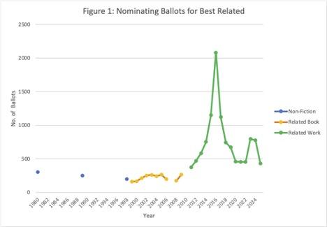
The data is very spotty for the Best Non-Fiction Book era, falling from 304 to 197 (but with only three data points). During the Best Related Book era, data is available for most years and falls within a relatively narrow range from 159-263. But when we enter the Best Related Work era, participation immediately increases and is consistently higher than in either of the two previous eras. Numbers rise to an absolute peak of 2080 ballots in 2016. This was the second of the two major Sad Puppy years when attention was high on the Hugo process. In addition to the Sad Puppy organizers encouraging people in their community to nominate, non-slate nominators had seen how a coordinated and focused campaign generating nominations could “take over” the Finalist list and responded the next year with a surge of participation. Nominations in 2015 had been twice the average of the previous several years, and nominations in 2016 nearly doubled that number.
At the same time, nomination numbers had already been rising sharply during the Best Related Work era, suggesting that the change in scope might have attracted more interest in the category. But can we disentangle general effects from those specific to Best Related? When we look at what percentage of all nominating ballots included nominations for Best Related (Figure 2), we don’t see an increasing proportion that would indicate a specific increase in interest for this category.
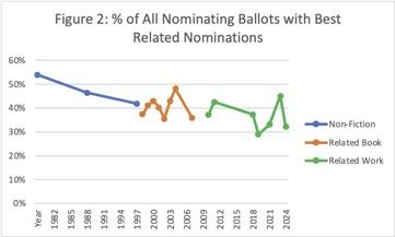
A problem occurs in that data for the overall total number of nominating ballots isn’t available for 2013-2018—the years when Best Related nominations are experiencing their highest peak. Figure 2 could be interpreted as showing similar numbers at the start and end of a peak as we see in the absolute numbers for Best Related, but where the main peak is simply missing from the data.
A more straightforward explanation accounts for the smaller peak in nomination numbers in 2023-2024 in Figure 1. Worldcon was held in China in 2023 and experienced a massive surge of interest in Hugo participation that—based on the works being nominated—can be attributed to Chinese members who had not previously participated in the Hugos. (In both years, two Chinese-created works were among the top nominees, although one item was determined to be ineligible.) The Best Related nomination data in 2023 shows some of the “cliff” phenomenon that—along with other factors—suggest that the nomination data may not be entirely reliable.[2] The 2024 nominations (in addition to being administered more transparently and reliably) make sense for this explanation. The top two nominees in 2024 are the two Chinese-authored works. If one subtracts the number of ballots on which the top nominee appears from the total, the result is directly in line with neighboring years. (In fact, if that same number is subtracted from the 2023 Best Related ballots, the result is nearly identical. This suggests that, whatever else was going on in 2023, we may be able to identify the number of Chinese-focused nominating ballots in this category as approximately 343.)
Did the change to Best Related Work generate a surge of interest in the category that also coincidentally aligned with the Puppy years? Or was this an overall surge of interest in nominating for the Hugos, with no special benefit to Best Related (again, coincidentally aligning with the Puppy years)? Since the overall ballot numbers for key years aren’t available, we can try an approximation by comparing Best Related nominations to Best Novel nominations—a category that we can expect to be consistently popular and that had no definitional changes in the relevant era. Figure 3 shows the same data from Figure 2 with an addition for Best Novel.
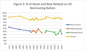
We do indeed see that Best Novel is included on a relatively stable proportion of ballots, mostly around 80 +/-5%. To try to fill in the missing years when we don’t have the absolute number of ballots, we can look at the ratio of ballots with Novel nominations and those with Related nominations. (Figure 4) Although all the data is included, we’re mostly interested in the Best Related Work era.
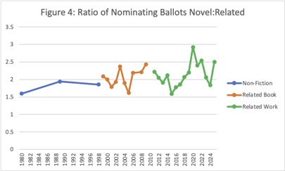
The ratios are quite varied during the Best Related Work era (1.59-2.92). For those key missing years between 2013-2018 the ratios are relatively low (that is, nomination rates for Best Related are more similar to that of Best Novel) and extremely similar to the ratios during the Best Related Book era. This argues that the spike in absolute nomination numbers following on the change to Best Related Work is not directly related to the change in category scope, but reflects a coincidental overall surge of interest in nominating.
From 2019 onward, absolute numbers of Best Related nominating ballots remain higher than in prior eras (more than twice as high) while the proportion of all nominating ballots and the relationship to Best Novel nominations becomes more erratic, but suggests a slight decline in interest relative to Best Novel.
What does all the above tell us? In general, over time, although there has been a massive increase in participation in Hugo nominations in all categories, the proportion of nominators who nominate in Best Related has seen a gradual but fairly steady decline. Is this specific to Best Related? Or might it be that with the continual expansion of specialty categories, more nominators find themselves only interested in (or knowledgeable about) a subset of categories? (It might not be surprising if Best Novel were an anomaly in terms of a consistent level of interest.) Unfortunately, to answer this question this analysis would need to be duplicated for multiple other categories, which is outside the scope of this project.
Distinct Works
Absolute numbers aren’t the whole story, though. What is the size of the potential nominee field? Logically speaking, with the expansion of scope at each era change, the number of works that might hypothetically be nominated presumably increases. Does this affect how many different items show up on nomination ballots? How is popularity distributed? What are the largest and smallest numbers of nominations that will make a work a Finalist? Or a Long List entry? As is often the case, the data is incomplete, but there’s enough to show some features.
When nominations are processed, an important (and labor-intensive) step is to normalize the data so that nominations for a specific work aren’t unintentionally attributed to multiple variations of its name. This means that the total number of distinct works is an available statistic, though it isn’t always reported. Figure 5a shows two numbers related to distinct works: the absolute number, and the ratio of distinct works to nominating ballots that include Best Related items. (Two different y-axis scales are used to include both on the same chart.)
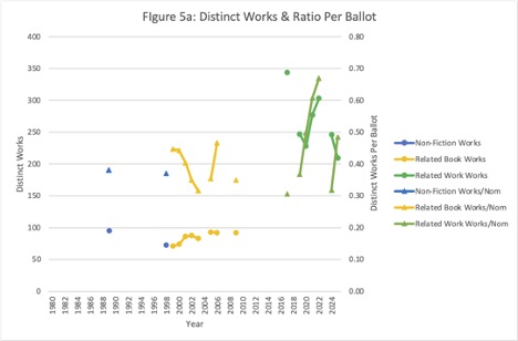
During the Non-Fiction Book and Related Book eras, the number of distinct works remains fairly consistent (71-95) even as the number of nominating ballots increases across the Related Book era. Under Related Work, the number of distinct works increases significantly and is consistently 2-3 times the number seen in the previous eras. This makes sense as the restriction to Book (and, realistically, to Books published by mainstream presses, given the dates) puts a practical limit on the number of publications that would reasonably be eligible. But with the expansion of formats and types of content, a vastly larger number of potential candidates is under consideration. In addition, the larger number of nominators would be expected to increase the number of distinct works in the “long tail” where only one or two people nominate the work.
Interpreting the relationship of distinct works to ballots is more complicated. In the three years from 2020-2022, the parallelism indicates that even as more distinct works are nominated, they are being drawn from fewer ballots. (Alternately, more people are nominating the maximum possible number of works, rather than leaving some of their nomination slots empty, and the larger number of nomination-events follows the long tail distribution, including more distinct low-frequency works.) That is, during these three years, diversity is increasing out of proportion to the number of people nominating. But when we consider the Best Related era as a whole, no such relationship exists, and certainly there is no overall trend. Note that the number of distinct works is not available for 2015 or 2016, the Puppy slate years. Due to the repetition of an identical set of nominees across a large number of ballots, we would expect the works-per-ballot statistic to be relatively smaller. On the other hand, the highest number of distinct works occurs in 2017, when nominating patterns were still being affected by reactions to the slating.
A different statistic can be used to answer part of this question: the degree to which people who nominate for Best Related are using all the available nomination slots. If a higher percentage of slots being filled corresponds to a higher diversity (relative to the number of people nominating in this category) then the mystery is solved. This assumes that the long tail pattern applies, and that a larger number of nominations means a larger number of nominees. Since the number of filled nomination slots isn’t directly available, we can best approximate it by calculating what proportion of the hypothetically-available slots are filled by the nominees above a certain cut-off. (The top 15 nominees will be used as this data is consistently available.) The comparison percentage is calculated by the sum of the nominations for the top 15 works, divided by the number of ballots with any Best Related nominations x 5 (the number of available slots on a ballot).[3] As a control for cross-category trends, this statistic for Best Related is compared to Novel, Dramatic Presentation Long Form, and Fanzine, to use categories likely to have established but distinct patterns. See Figure 5b.[4]
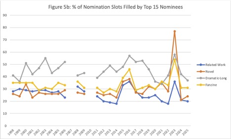
In 2009, one of the years with the largest extended nominee list reported, the report also provides the total number of nomination slots filled, so we can compare the top-15 percentage to the overall percentage. The results are:
- Best Related: 43%
- Novel: 62%
- Dramatic Presentation – Long Form: 52%
- Fanzine: 58%
Three observations are most obvious. The percentage of slots filled for a particular category tends to be relatively consistent, and three of the categories have fairly similar rates. Years with anomalous nomination behavior (2015 & 2016 the major Puppy slate years, and 2023 the Chinese Worldcon year) show a relatively higher percentage of slots filled, which would make sense either in terms of a significant proportion of ballots filling out a nomination slate (which would be included in the top 15) or some other phenomenon that appears as a “nomination cliff.”
As a third (but less relevant) observation, Dramatic Presentation behaves differently, having a higher rate of slots filled, but also a rate that is less affected by anomalous years. In addition, the complete percentage-filled for Dramatic Presentation in 2009 is much closer to the top-15 percentage than for the other categories (with a ratio of 0.83 for Top 15: All, compared to ratios of 0.42-0.65 for the other categories). This makes sense if nominators are working from a much smaller set of potential nominees and therefore the long tail represents a smaller proportion of the total nominations. The tendency of Dramatic Presentation to pull from major studio movies also means that works on the Sad Puppy nomination slates were primarily works that would have been nominated apart from the slates.
A slightly less obvious observation is that in the years when we first see a substantial increase in nominator numbers (2011-2014), we also see a slight but general decline in the slots filled for the non-Dramatic categories. This aligns with previous hypotheses that as number of nominators increase, there is either a decrease in investment in filling out a complete nominating ballot, or an increase in the proportion of nominations falling in the long tail (and so missing the cut-off for the top 15).
This brings us back to the question of how the percentage of slots filled relates to the number of distinct works listed. To examine this relationship, two statistics are combined in a single graph, on two different y-axes in Figure 5c: % slots filled by the top 15 and number of distinct works divided by nominating ballots.
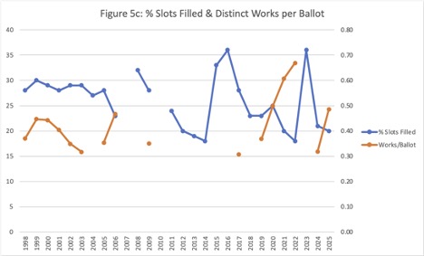
There is no consistent overall relationship shown by this graph. In the early part of the Related Book era (1998-2003), it would appear that distinct works decrease in parallel with slots filled, which one might expect to be the pattern if all other factors are equal.[5] In contrast, during the only other sequence when both statistics are available (2019-2022) the correlation is the opposite, with works per ballot increasing as percent slots filled decreases and overall number of distinct works increasing (as seen in Figure 5a). That is, diversity of nominated works is increasing even as more people are submitting only a partial nominating ballot. One possible explanation would be a much greater prominence of the long tail, due to the expanded conceptual scope of possible nominees. This wouldn’t explain the relationship between the numbers in 2024-2025 when the total number of distinct works decreases, even as the works per ballot increase, while the percentage of slots filled is relatively stable. There are probably too many interactive factors to have confidence in any particular explanation.
Overall with respect to nominee diversity, while we can observe that the available data during the Related Work era shows much greater diversity of distinct works than previous eras, both in absolute and relative terms, we aren’t able to entirely tease out the possible influence of reactions to the Sad Puppy events.
Thresholds for Finalist and Long List
The criteria for organizing threshold data were discussed under the Analysis Process chapter, as it involved making some editorial decisions around the change in how nomination data is processed. Figure 6 shows the percentage of the total Best Related nominating ballots required to make the Finalist and Long List thresholds. As usual, the data for the Best Non-Fiction Book era is extremely sparse, making it impossible to do a valid comparison with the later eras.
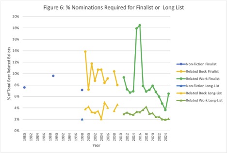
There’s a fair amount of year-to-year variation during the Best Related Book era, but as an overall trend, there’s a slight decrease in the threshold for Finalists, but a fairly stable threshold to make the Long List. Considering the absolute number of Best Related ballots, the number of distinct works, and the percentage of ballots required to final, there is a clear interaction during this era. As seen in Figures 1 and 5, ballot numbers increase somewhat in the first half of the era then stabilize, and the number of distinct works also increases somewhat in the first half of the era then stabilizes, while the overall trend for percentage of nominations required to final decreases (Figure 6). Together, these indicate an expansion of the nominator pool and, as a result, the set of works they’re familiar with. Nominations are distributed over a larger number of candidates thus resulting in the lower percentage threshold. Although a logical story can be made for the relationships, the interactions can be complex.
In the Best Related Work era, things get even more complicated and interesting. If we temporarily exclude 2015 and 2016, we appear to be continuing the overall decline in the percentage of ballots needed to make Finalist (which again coincides with overall higher nomination numbers and a significantly higher number of distinct works under consideration). The cutoff to make the Long List remains relatively steady around 3-4% (similar to the previous era, but more consistent), then declines gradually starting after 2017, when the EPH nomination processing system is implemented. (Since the analysis is of the actual number of nominating ballots at last position, the EPH calculations themselves shouldn’t be a cause, however it’s possible that nomination patterns are subtly affected, with people more likely to nominate a wider variety of low-popularity works. This is pure guesswork, however.)
As an overall pattern, this would suggest that across both these eras the distribution curve is flattening, with less concentration of the available nominations at the highest range. But since the Long List cutoff (approximately position #15) is remaining relatively stable, this flattening isn’t necessarily affecting the entire “tail” of the distribution. Overall, what we may be seeing is a decrease in the tendency for a small number of works to be extremely well-known and popular, across the entire nominator pool which could make sense in combination with the broadening of scope of the category.
But let’s go back to those two years that we set aside: 2015 and 2016, when it required getting on at least 18% of the Best Related nominating ballots to make Finalist. These were, of course, the peak Sad Puppy slate years and need no other explanation. If the five slated works in 2015 were set aside, the absolute number of nominations required to final would be similar to that of 2014. In 2016, it becomes more complicated because nominators responded to an awareness of the slating activities by increasing participation. In that year, if the slate is excluded, the number of nominations required to final would be about 25% higher than in 2014. (It isn’t easy to calculate what percentage of nominations would be needed as it would require knowing how many nominating ballots were submitted solely in response to the existence of the slate, on one side or the other.)
In 2017 (when EPH had neutralized the effects of slating and people were aware that it was intended to do so), absolute nominating numbers required to final remained higher than pre-slate years (reflecting the relatively high nomination numbers), then fell closer to previous numbers by 2018. As the figure shows, there was a steep fall in the percentage of ballots needed to final between 2020 and 2024, only recovering to something resembling the overall trend in 2025. This is the same period when the threshold for the Long List is also declining (slightly) and probably reflects a parallel dynamic. (The effect of the relatively high number of distinct works during this most recent timespan can’t easily be analyzed, as that data isn’t available for the earlier subset of the Related Work era.)
In general, the thresholds for making Finalist or Long List as a percentage of the total nominating ballots for the category make sense in terms of the expansion of the category scope, combined with the increase in number of nominators, resulting in a wider variety of works being nominated and thus nomination numbers being relatively more distributed.
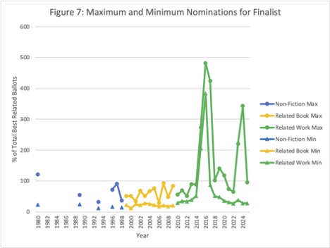
For a slightly different angle on this question, Figure 7 shows the maximum and minimum nomination numbers for Finalists. If anything, when viewed as absolute numbers rather than percentage of nominating ballots, the threshold for Finalist is even more stable. The Non-Fiction and Related Book eras are highly similar (12-28) while the Related Work era begins and ends around the previous high (27-28) but in between shows a gradual increase, the anomalous highs of the Puppy years, followed by a gradual decrease. (Note: 2017 shows the highest non-Puppy threshold but, as previously noted, nominating participation may have been higher due to community response.) The elevated nomination numbers in 2023 and 2024 did not significantly impact the Finalist threshold in absolute numbers. In 2023 this was due to the disqualification of 2 works with high numbers of nominations. There was a “cliff” comprising the 7 works with the most nominations (119-221) followed by a steep drop-off to the next highest (38), which became a Finalist after the disqualifications. In 2024, while the 2 works with the most nominations did, in fact, benefit from large numbers of nominators listing Chinese-language works, no other works received unusually large numbers of nominations, including the 2 other Chinese-language Long List members.
The maximum nomination numbers, as might be expected, are a lot more variable, presumably reflecting the individual popularity of specific works. This is probably illustrated most directly by the 2017 nomination of Kameron Hurley’s The Geek Feminist Revolution with 424 nominations (the next highest number is 133) which—in addition to the work’s objective qualities—caught the zeitgeist of progressive/feminist reaction to the preceding Puppy years.
Nomination Numbers and Winners
Although this analysis is primarily focused on the overall dynamics of what is nominated for the category rather than individual works, one additional observation related to nomination data is interesting: is the work with the largest number of nominations the eventual Winner?
Due to the scarcity of nomination data in the Non-Fiction Book era, no solid conclusion can be offered, but in 3 out of 4 years when data is available, the answer was yes. In the 12 years of the Related Book era, 6 top nominees won and 6 did not. In the 16 years of the Related Work era, 1 top nominee won and 15 did not. Visibility and popularity leading to high nomination numbers will get a work on the ballot, but increasingly it provides no prediction of the final result.
Summary
Overall, the data suggest that general interest in the Best Related category has not been affected by changes to the category definition, but rather has reflected overall changes in nominator interest in the Hugos as a whole. In contrast, the expansion of the category scope in the Related Work era may have had an effect on the increasing number of distinct works being nominated and consequently a lowering of the threshold of nominations required for key thresholds. However the impact of larger community issues (that presumably affected all Hugo categories) make it difficult to draw firm conclusions about any overall trends for Related Work. As the general expansion of nominator numbers coincides with the Related Work era, it’s possible that the expansion of distinct works and decrease in thresholds is a general phenomenon and not tied to the Related Work scope change at all. Further study would be needed to answer this.
[1]. In general, I’ve kept first-person comments confined to the footnotes, but this one belongs in the main text.
[2]. See the Hugo-Finalist Essay “Charting the Cliff” by Camestros Felapton and myself. https://docs.google.com/document/d/e/2PACX-1vSsNSBeLmp6MIuJX3ZEVTlw-Xj2A....
[3] This approach can produce anomalous results in the context of slate nominating, so attention must be paid to the years 2015, 2016, and 2023, when nomination slates are either known or suspected to have been present.
[4] Properly speaking, Figures 5a, 5b, and 5c should have had sequential numbers, but I expanded the analysis late in the write-up and didn’t want to renumber the subsequent 37 Figures.
[5] All other factors are rarely equal, but as seen in Figure 5a, the absolute number of distinct works in this period is relatively stable, so the simple explanation is probably correct.
Major category: